Google Play developers are working on improving not only the version of the marketplace for mobile devices on Android, but also on the desktop version of the game and application store.
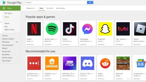
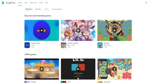
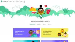
Rejection of the “flat” design is not the only update. In addition, the store has received a host of other cosmetic improvements. In particular, the sidebar has been changed to tabs at the top of the display. The developers also divided the software into sections according to the type of device (smartphones, tablets, TVs and laptops with Chrome OS on board).
Application icons have also been changed: they are made in a more rounded form. At the same time, the programs, as before, are arranged on the screen in the form of a grid, while the recommendations are displayed in the form of a grid. The program covers themselves are now more realistic.
We can say that the updated design of the marketplace has become consistent with the Material You interface that is coming into fashion. At the moment, the appearance of the Google branded app store is available to a limited number of users, but soon all owners of Android devices will be able to appreciate it.

Old Design

New design
Rejection of the “flat” design is not the only update. In addition, the store has received a host of other cosmetic improvements. In particular, the sidebar has been changed to tabs at the top of the display. The developers also divided the software into sections according to the type of device (smartphones, tablets, TVs and laptops with Chrome OS on board).
Application icons have also been changed: they are made in a more rounded form. At the same time, the programs, as before, are arranged on the screen in the form of a grid, while the recommendations are displayed in the form of a grid. The program covers themselves are now more realistic.
We can say that the updated design of the marketplace has become consistent with the Material You interface that is coming into fashion. At the moment, the appearance of the Google branded app store is available to a limited number of users, but soon all owners of Android devices will be able to appreciate it.
Login or register to post comments


Comments 0