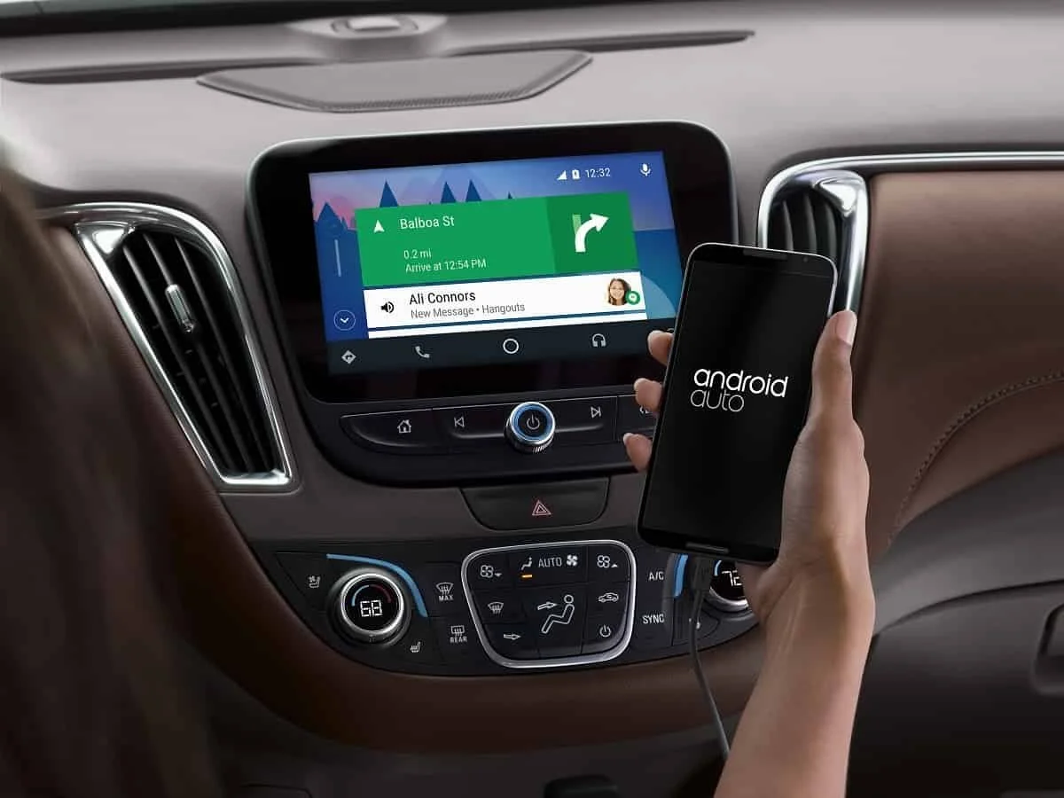
A global change in the service interface was announced this year. And so, on November 14, Google introduced an application with an updated design. But so far it is not available to everyone.
The download of the new version of Android Auto is limited due to beta tests of the program. Previously, to participate in the test program, the user had to register, but at the moment the registration limit has ended. Also, Google did not name the release date for a stable build of Android Auto with an updated design.
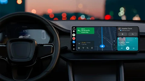
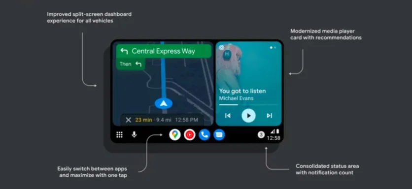
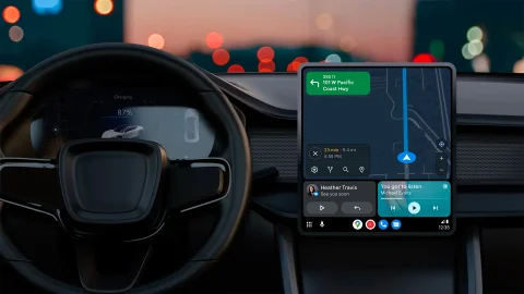
The application interface has been redesigned as much as possible: now all elements on the screen are combined into blocks, which allows them to be optimally placed depending on the display size and orientation. This approach made it possible to solve the problem with different screen sizes in car multimedia systems. Also, Material You design elements appeared in the interface.
All in-app notifications are now hidden behind a single button in the status bar. When you click on it, notifications open in a small menu. Similarly, the recommendations of the voice assistant are hidden: to open them, you just need to swipe across the screen, and then the user will see recommendations for music and other media content.
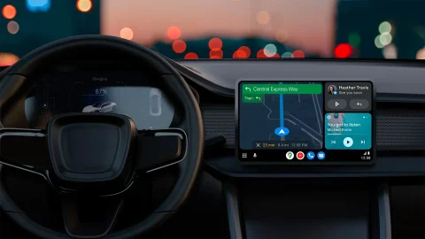
In addition, the application has become possible to open full-screen maps and switch between applications through the dock with icons. When the new features will become public, Google has not yet announced.

The download of the new version of Android Auto is limited due to beta tests of the program. Previously, to participate in the test program, the user had to register, but at the moment the registration limit has ended. Also, Google did not name the release date for a stable build of Android Auto with an updated design.

The application interface has been redesigned as much as possible: now all elements on the screen are combined into blocks, which allows them to be optimally placed depending on the display size and orientation. This approach made it possible to solve the problem with different screen sizes in car multimedia systems. Also, Material You design elements appeared in the interface.

All in-app notifications are now hidden behind a single button in the status bar. When you click on it, notifications open in a small menu. Similarly, the recommendations of the voice assistant are hidden: to open them, you just need to swipe across the screen, and then the user will see recommendations for music and other media content.

In addition, the application has become possible to open full-screen maps and switch between applications through the dock with icons. When the new features will become public, Google has not yet announced.
Login or register to post comments
Comments 0