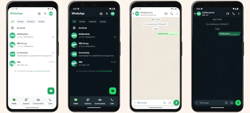
The updated design of WhatsApp was demonstrated in insider screenshots

The beta version of the application for Android will receive a new view of the chat list and dialogue screen in normal and night modes.

The three-dot menu icon in the upper right part of the display has disappeared, and the archive and selected tab icons have also turned green. In addition, the list of tabs in the bottom panel has changed: instead of the Status directory, an Updates tab has been added. At the same time, the appearance of the pinned chat icon has changed, the tooltip at the end of the list of chats has disappeared, and the outlines of the tabs have become darker.

The chat screen also gained a white panel at the top, but overall nothing has changed: the camera icon became transparent, the emoji menu moved to the left side, and the attachments menu to the right. Plus, the paperclip logo was changed to a plus icon. The updated design is available in the beta version of the application 2.23.20.10. It has not yet been announced when this version of the messenger will become publicly available.

The three-dot menu icon in the upper right part of the display has disappeared, and the archive and selected tab icons have also turned green. In addition, the list of tabs in the bottom panel has changed: instead of the Status directory, an Updates tab has been added. At the same time, the appearance of the pinned chat icon has changed, the tooltip at the end of the list of chats has disappeared, and the outlines of the tabs have become darker.

The chat screen also gained a white panel at the top, but overall nothing has changed: the camera icon became transparent, the emoji menu moved to the left side, and the attachments menu to the right. Plus, the paperclip logo was changed to a plus icon. The updated design is available in the beta version of the application 2.23.20.10. It has not yet been announced when this version of the messenger will become publicly available.
Login or register to post comments
Comments 0