A Random Decision: Mirror's Edge Developers Reveal the Origins of Their Signature Visual Style

Mirror's Edge, released in 2008, was remembered by players not only for its unconventional parkour gameplay but also for its unusual visual presentation, which made the project stand out from other games of the era. Years later, the creators revealed that its iconic look arose largely unexpectedly.
Art director Johannes Söderqvist and producer Owen O'Brien admitted that in the early stages, the game looked quite typical of Unreal Engine projects of the time. The visuals featured a then-fashionable yellow filter and an abundance of detail, making Mirror's Edge stand out among other shooters and action games. The team considered this a serious problem, as the project lacked a distinct identity.
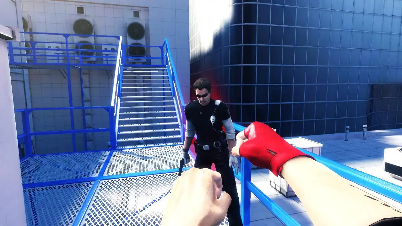
Over time, it became clear that the overloaded and warm color palette was causing discomfort and even motion sickness in testers. In an attempt to understand the problem, the developers created an experimental version in which they disabled almost all textures, leaving only simple color elements for navigation. This prototype became the starting point for the new style.
Thus, the concept of a sterile white city with contrasting color accents and red interactive objects was born. The designers had to carefully balance the level of detail to ensure the world remained legible and retained a sense of space.


There are no comments yet :(